- Home
- Unit 1: Typography & Graphics
- Unit 2: Line Artist Homages
- Unit 3: Contour Line
- Unit 4: Frankenstein and Form
- Unit 5: Christmas Complements
- 5a: Candle Still-Lifes
- Unit 6: Figure Drawing
- Unit 7: Giacometti-inspired Sculptures
- Unit 8: Grid Enlargement
- 9. Group Projects
- 10. The Clay Suns That Weren't
- 11. MISC...Closing Remarks
- Contact
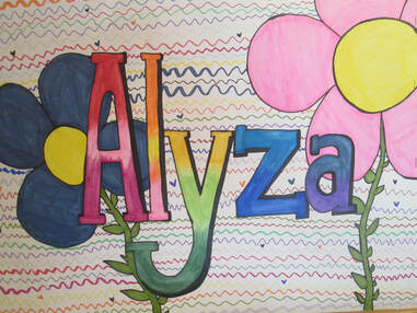
Studio Art students began their year by creating portfolios with a complex mix of typography, design and composition rules. (Art Lady doesn't think they probably liked it too much because it was heavy on technical jargon, measuring, and drafts and redrafts until letter sizing, spacing and styling were of a near professional grade.)
OBJECTIVES:
OBJECTIVES:
- To create a typeface that reflects the student's personality and ties in with an illustration visually and thematically
- To letter the student's name, carefully observing letter heights and widths, branch weight, style consistency and balanced spacing between letters.
- To compose an eye-catching, balanced and varied design which incorporates graphics and typography -- where the student's name is the focal point.
- To demonstrate mastery of blendable Design Markers.
Hover or click on the large image below to get the "Play" prompt.
Click on "Play" to start the rotation of slides.
Click on "Play" to start the rotation of slides.
MORE TYPOGRAPHY SUBMISSIONS
